Warburtons Student Feedback

Another student viewed my animation, and these were their comments:

The Character design is great.

I like the way it is framed.

Animation is slightly jarring at times.

It is a bit difficult to understand story wise.

After watching my animation again i do agree with these comments  and i do admit with some of the issues, I was aware of them, and i will be able to fix them in an hour of Marks lesson.

Warburtons Storyboard and Sketches

StoryBoard

Scan 6.jpegScan 7.jpeg

This is my storyboard, i used these as and outline for my animation and i used these to produce my animatic.

Sketches

Scan 1.jpeg Scan 2.jpeg Scan 4.jpeg

Scan 7.jpeg Scan 8.jpeg Scan 9.jpeg

Scan 10.jpeg Scan 11.jpeg Scan.jpeg

These sketches were made after looking at my storyboard and different inspirations online, i then used them to inspire my sketches.

Animation Presets

This slideshow requires JavaScript.

This slide show includes all the presets I used in my animation, it also includes presets i did not use, i made these presets using Adobe Photoshop and i used my drawing to make them, I then imported them into Adobe After Effects.

Warburtons Animated Advert and Evaluation

The advert ended looking good, i was able include most of the characters i wanted to include minus the inclusion of 1 characters but even without this character, my advert turned out looking good.

I started of this project by researching different animation styles and i would say my advert was heavily influenced by the animation of Avatar: Last Air Bender and Avatar: Legend of Kora which in turn were inspired by the Japanese animation style, this is how i wanted my animation to look like but also i was looking at the animation style of South Park which looked different and simple.

After i look at the different animation style, i then look for different images and drawings to base my characters on. I started of by looks at human images and in turn, human drawings  I then draw them myself after this i looked at different Pokemon drawings and images i ended up picking Pikachu because of how iconic it is, after this i worked on the environments and props.

After finishing my drawings I began to scan  everything onto the computer and began to redraw and add colour to them using Photoshop after this i began to put each image on its on individual layer so when I imported every drawing into After Effects.

I used Adobe After Effects to create my animation. the thing i would improve from my animation would be the absence of sound, I feel that the addition of sound would have made the animation more engaging and interesting. I think next time instead of going for a South Park feel, and addition of walk cycles would make my animation more professional.

These are changes Have made to my animation after I received some feedback from a fellow pupil, by adding sound, I have made the story more understandable i have changed some of the characters so they do not look the same as other characters. i feel that i have made all the necessary changed the I revived from the my feedback, it has greatly improved my animation.

Stop Motion Q

The letter I was given for my stop motion was the letter Q,  I feel it turned out very well all the scenes from my storyboard were able to be used in the video. To improve the video, I would say that adding sound to the video would have made it more realistic and brought it to life, i would say adding some text to the video to coincide with each scene would have helped to explain the scene.

This is the my final improved Stop motion alphabet video it includes text and  sound.

F1 Moving Hud

Using After Effects, i was able to bring my game hud to life, the gauge and the bottom left map worked well but there are still improvements that need to be made, such as putting an indication of the F1 onto the moving map, i also wish i could have put the Battery percentage gauge next to the speedometer.

Putting power ups on to this video would have been a great indicator of what the vision of my game would have been like, i also wish i made the video look more futuristic just like i intended my game to looked like.

Final racing game UI visuals/Evaluation

Team fly.jpg

Team Horn.jpg

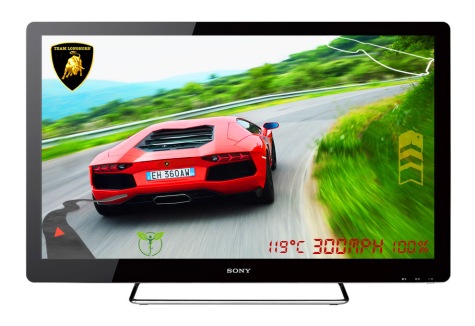
For my Ui i wanted my game to have a futuristic approach in that i have not used an analog system to show speed, car temperature and battery consumption i wanted to make all this information appear digital  because not many cars have digital dashboards and because this game features electric cars, i thought a digital display would be appropriate.

To make my game different to other people, i decided to add power up to my game similar to Mario Kart and Blur. This style of gaming would bring a different dynamic to the game, it also influenced the visual style, i wanted to go for a more futuristic style i made the decision to do this because our cars had to be battery power and i felt that, this would be a good way to represent the future.

Adding the television was a good choice because it makes the image seem more immersive, it makes you feel like you are playing the game. the blur in the image helps as well as it makes the player feel the they are in a real car because the faster the go, the more blur there would be towards the rear of the car, the faster the player will feel they are going.

I feel that my visuals ended ended up looking very good, the cars I wanted use, they are super cars, I added a battery percentage gauge to show that they cars were battery powered; this is near the  temperature gauge and speedometer, what i would change from this would be how professional they look, i wanted them to look like a for professional speedometer so they fit with the visual look of the game.

as for the rest of the screen i added the team logo in the top left hand comer, my logos ended up looking very good and professional  and they look familiar to existing manufactures to improve these i think making my own logos fro scratch would have helped. i added 2 maps on the screen, the map on the top right corner is 2D and is static and the map on the bottom left is 3D and moves to show where the player is on the map in relation top the track.

Lastly, the power ups were made to set my game apart from other people, a player can only hold 2 power ups at a time and when the power up is being used, the power up that is active will be put on too the right hand side. just like the speedometer i wanted to power up bar to look more professional and clean to fit the futuristic aesthetic.

Over all the visuals of my game ended up look good and to my vision the only thing that would have made the visuals look better would be if they looked more professional and if it looked more computer generated, although the realistic cars brought my visuals to life and made them look like screenshots from a cinematic trailer.